
PatrickGeorge
(PatrickGeorge)
This new brightly coloured picture book from indie publisher PatrickGeorge has a very self-explanatory title and is therefore all about, well … opposites: in-out, land-sea, empty-full, to name a few. But what could easily be another rather insipid early learning book teaching opposites using a range of flaps and other novelty features turns out to be a visual fest of colours, design and simple yet very clever use of acetate sheets. Each pair of opposites is displayed on a double page, with an acetate sheet in between. By flipping the acetate from one side to the next, the reader can reveal the opposite. This allows for a really unusual take on the concept of opposites; for example, the flame (which is on the acetate) for HOT becomes the drip of water from the tap for COLD, trees (which are on the acetate) for LAND become sails on boats for SEA:
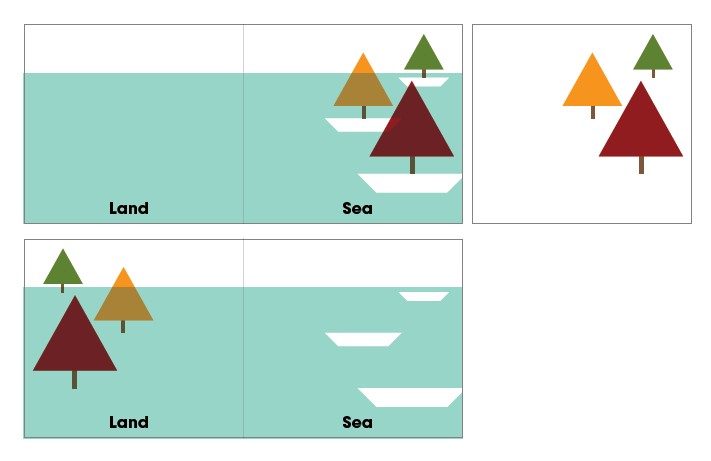
The effect is stunning, and any fan of graphic design would be delighted by this wonderful book. This is my favourite pair:


I think that because of the clever visual twists, this book will actually be enjoyed way beyond preschool years, and probably even more by older children. My son is really loving this book; he is a big fan of French illustrator Hervé Tullet’s book Moi c’est Blob (see Hervé’s website here), which has a similar feel. I think what my son is fascinated by is the display of diverse visual perspectives.
This is a great book on the notion of opposites; its bold colours and simple illustrations will be particularly eye-chatching for young children. But the clever concept and innovative way of conveying its theme insures that this book is leagues above the rest of similar offerings and will be enjoyed and appreciated by a much wider audience.